A while ago I got an invitation to beta test the new social bookmarking service on the block: Ma.gnolia. I was interested in it from day one I heard about it, however back then I had no idea what it was about. My reason for being biased is that I love magnolia trees, Fredrika and I used to go look at a huge one in a park close to where we first lived together and I also recently got her two magnolia trees for her birthday.
First, let me outright say that I’ve never really found a need for a bookmarking service, my main need and interest lies in following feeds; instant information and then it’s gone. If there’s anything I have a great need for finding again, I search on the web using Google and mix of suitable keywords. Therefore, it’s interesting to see that Ma.gnolia’s slogan is:
Found is the New Search
I personally don’t think that it will ever happen; I and a lot of other people do constant searching on the web and in applications. I’m sure a good service can complement searching, but it will never replace it.
Features
The idea is to save all your bookmarks and have them available on the web from any place. It’s also about tagging your bookmarks and finding other people’s. So far, just like del.icio.us but looking a lot better. There are, however some features and here’s a list of them:
Save bookmarks, publicly or privately
Tag bookmarks
Send bookmark to one or several of your contacts
Send bookmark to one or several of your groups
Find other people’s bookmarks
Join special interest groups
See your contact’s latest additions
See your groups’ latest additions
The factors I find very appealing is the ability to join certain groups covering special topics, and to add a few key people to your contacts’ list that you know will add interesting bookmarks. The nice thing with contacts is that it doesn’t have to be a two-way relationship. You can have anyone as a contact without getting permission and anyone can add you as a contact.
They way I see it, there’s no downside with people adding you as a contact without your consensus, all they can see is your latest bookmarks. However, I guess in the long run it might be interesting with closed groups that require an invitation, or perhaps a “Make this bookmark only available to certain contacts”.
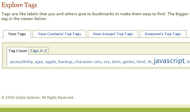
There are also different views in the Tags section where you can browse your tags, your contact’s top tags, your groups’ top tags and everyone’s top tags, and they can all be viewed in a tag cloud or in an A – Z listing.
The start page
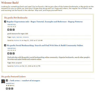
During the beta period, the start page consisted of your, your contact’s and your groups’ latest bookmarks. A good initial view that unfortunately was replaced with a Ma.gnolia Hot Bookmarks and a Ma.gnolia Featured Linkers section after it was launched February 15th. The hot bookmarks are fine, but I would definitely prefer seeing my contact’s latest bookmarks as opposed to the featured linkers that I haven’t chosen nor is interested in. Now you have to go to the Bookmarks section to get the beta start page view. Also, once you’ve left the start page, the only way of getting back is clicking the logo. Perhaps a Home link should be added?
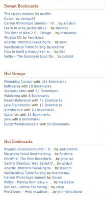
Other sections on the start page, in narrower right column, are Recent Bookmarks, Hot Groups and Hot Tags (and also Hot Bookmarks for other pages than the start page). All valid, but I really miss a listing of my tags. I gather most people will use this service as an archive for their bookmarks, nothing more, nothing less, so I think it’s a waste of an extra click to go the Tags section first.
Something that’s weird here, though, is that the start page just exclaims:
Welcome back
and then I go to the Bookmarks section that says:
Hello, Robert
Shouldn’t the start page be the most personal one?
Listings
Most bookmark listings contain three actions for every bookmark, with the addition of a fourth to easily switch your bookmarks between being private or public. The problem arises when I look at listing for a specific tag; then there’s no way to add it to your bookmarks and its name is linked to the URL itself. I missed it a couple of times, but the only way to add it is to choose the option View Details. I definitely feel an add functionality is missing there.
Another thing which I dislike is that the listing in the right column leads directly to the URL that the bookmark point to. I guess makes it easy to just go to that web page right away and see if it’s interesting, but there’s no way to add it from that list. Functionality I think should be added as soon as possible.
Another thing that would be nice to see right away in the listings is how popular a bookmark is, i.e. how many people have the same bookmark.
Design & code
The design is very nice with smooth and balanced colors. Default font size is good and it’s very easy to get a fast overview on what’s every page. Unfortunately, there’s a an ad space in the header, something that has to be there for revenue, most likely, but also something that ruins the cleanliness of the web site (it was so beautiful during the beta period :-)).
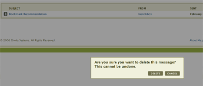
I also like the dimming of the entire web page when I want to delete something. Kind of hard to miss… 🙂
Another thing that looked good during the beta period was the state of the code, but now there seems to be some minor flaws in every page and also a few inline events. All-in-all, though, the code seems to be well-structured and semantic, so there’s definitely hope.
Gripes
The web site is, most of the time, fairly slow. This is disheartening since it’s a very nice service otherwise, and I really advise them to look into this as soon as possible. Soon the honeymoon period is over with the service being new, so it should be addressed right away. Also, for performance and small usability enhancements, dare I *GASP* suggest using some AJAX (Pssst! Look at ASK…)?
The issues with the listings are annoying but minor. I don’t think it would be a big deal to change that.
Conclusively, I’m not sure that I have the need for a bookmarking service. But if I ever will, Ma.gnolia would be my choice. The good news is that Ma.gnolia is publicly available now for everyone, so I urge you to go check it out!
Microsoft has now publicly released IE 7 Beta 2 Preview, which you can download in their IE page. It is only available for Windows XP SP 2 as of now. Naturally, your favorite blogger (yeah, you know it’s true, just admit it! ;-)) has taken it out for a short test drive.
The good
The interface
It has a very nice and intuitive interface. I really like the rearrangement of menus and buttons; clean and sleek.
The zoom feature
Without a doubt, this is the best feature of this release! I wrote about my opinion about this in Web browser vendors are also responsible for accessibility and this is exactly what I’m looking for. The combination Ctrl + scroll wheel or Ctrl + +/- now zooms a web page.
Searching in the history
They have added a Search History feature. Seems like a great idea, but for some reason it never worked for me.
No more almighty select elements
It works positioning elements on top of select elements so they don’t shine through. Finally!
XMLHTTPRequest support without ActiveX
XMLHTTPRequest now works even if ActiveX controls are disabled.
Anti-aliased text.
It looks like the text in the web browser now is automatically anti-aliased.
Conditional comments support and consistency
Conditional comments are still supported and in a consistent way. You can use code like this to only include code in versions of IE prior to IE 7 (most likely CSS fixes):
No min-width/max-width or min-height/max-height support
This isn’t just bad but outright irritating! The incorrect handling of width and height is behind many flawed layouts on the Internet, and to see that this still isn’t supported is outrageous!
Lack of support for pseudo-classes
Pseudo-classes like :hover, :focus, :after and :before have no support (except for, naturally, :hover on a elements). Microsoft claim that :hover should be supported on all CSS
elements (what the hell a CSS element is…?), but I couldn’t get it to work on any other element type.
No resizing of fonts in pixels
Resizing fonts specified in pixels still doesn’t work. To my knowledge, the only web browser on the market that doesn’t support it.
I found something that shocked me when I tested this web site: no content was shown but the background color. After some research and testing, I found the error. I use an element for clearing floats that looks like this:
The result of this that everything vanished! I thought that maybe it had something to do with the margin-top or overflow property, but no. It was height: 1px that threw it off so much. And the thing is, no matter what height I set the element to, it didn’t work. I had to completely remove it, and then things worked just fine. Terrible!
A while ago I read Garret Rogers’ post The personalization war, which in part inspired me to write this introduction to different personalized start pages. So what are those, really?
The main purpose of such a start page is for you to get a good and easy overview of a lot of things, including the feeds you follow. Different services also offer different gadgets that you can use, such as seeing your e-mail inbox. Naturally, one of the most useful parts of this is that you have access to the same start view and information wherever you are and whatever computer you are using.
Most of them are, of course (sigh…), in a beta state, so I haven’t really taken that into my observations. I’ve tested them in different categories, and I name a winner for each and finally, a total winner. Live/Start is developed by Microsoft, but I’m not sure if Start will still be around and if they’re putting all their energy into Live now. Both are pretty much the same service right now, though.
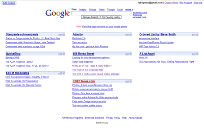
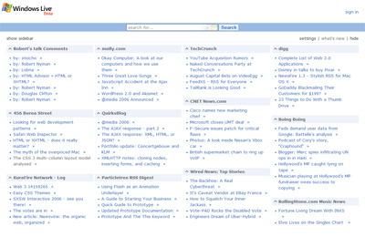
Design
Google Personalized Home’s service looks pretty much like all of the other Google services, as opposed to Netvibes and Live/Start who have got very lean interfaces. Netvibes has also got a nice distinct background and borders around its parts to easier tell them apart. My Yahoo! offers a lot of themes, and each and every one of them almost makes me barf.
Winner: It’s a tie between Netvibes and Live/Start.
Usability
All of them, except My Yahoo!, rely heavily on an AJAX approach with drag and drop to position your different parts wherever you feel like. Netvibes and Live/Start also offers the possibility to expand and collapse different parts, where Netvibes also has links for expanding/collapsing all parts. Netvibes is the only one showing you a number of unread posts for each of your feeds.
Google Personalized Home and My Yahoo! only present direct links to the posts in your feeds, whereas Netvibes and Live/Start present the text for each feed when a link is clicked, together with the other posts for the same feed, and there you can choose to expand or collapse the text for all of the feed’s posts.
Netvibes and Live overlays a “page/window/layer (yeah, I’m sorry for that word :-))” that fills the entire web browser window when the links are clicked, as opposed to Start that just opens a small one. Start’s behavior is definitely the one of these I prefer.
Live/Start also offers small arrows after each post in a feed which is a direct link to the post in question. This would have been great, if they haven’t added the functionality to these links to automatically open a new window. Extremely annoying. This is 2006, ok? People want to choose themselves if they want to open a link in the same window, a new window or a new tab; don’t force a behavior on users. And if you’re so worried most users won’t get, just offer this as a setting then.
I wish Netvibes would also have these arrow links, but naturally not with the behavior mentioned above that Live/Start have. In the overlay that is opened up, Netvibes’ also dreadfully opens new windows when each direct link to another web page is clicked. Stop it! Now!
Settings-wise, Live/Start is the winner with offering you how many columns you want to use, from one up to four columns. My Yahoo! is the only other service offering this, with the choice of two or three columns. My wish is that all of them should really offer a way to see the text for each feed post in the same view when it’s clicked, and also to expand or collapse all posts for a certain feed or the entire web page. I also wish Netvibes would add a way to mark all posts for all feeds read.
Another thing that blows my top is that the sign in-link on Live for a long time didn’t work in Firefox. Then they fixed it, but apparently added some new update, so now it’s broken again. It’s just a link, dammit, how hard can it be? And the number of dead links and things of inconsistency one stumbles on while using My Yahoo! are too numerous to mention.
If it hadn’t been for Live/Start forcing me to use a Microsoft Passport account, I would’ve declared a tie between Live/Start (because of being able to choose what number of columns to have, and Start also for its nice reading window) and Netvibes (for its unread items feature). However, because of that, it tripped Live/Start at the finishing line.
Winner: Netvibes.
Accessibility
I turned off JavaScript, and not surprisingly, none of them had a full proper fallback. Netvibes and Live/Start didn’t even render any content nor give me a message saying that I had to have JavaScript enabled. Most of the links didn’t work either for Live/Start when tabbing to them and then pressing Enter. Google Personalized Home rendered the content fine but told me that I had to have JavaScript enabled, and has a text saying that it now works on mobile devices (I haven’t verified this). My Yahoo! kind of worked without JavaScript except for some parts.
Winner: My Yahoo!
Importing/exporting OPML
The most efficient way to use your feeds in different services is to have them categorized in an OPML file and then just import them. Netvibes and Live/Start offer importing as well as exporting of OPML files, although, for some, reason, Netvibes didn’t work correctly with my OPML file that seems to work fine for all the other services on the web. The problem was that I could indeed import the feeds but then the grouping went wrong so I could never see the content of any feed or add it to my page.
Google Personalized Home and My Yahoo don’t offer neither of these, which, to me, is shocking.
Winner: Live/Start, for working flawlessly with feeds.
Gadgetry
Google Personalized Home offers you seeing your GMail inbox (surprise), My Yahoo! offers you to see your Yahoo! Mail (another shocker) and Live offers you to see your Hotmail (yeah, I’m trembling with excitement now…). However, Live also has a number of other gadgets for you to use, where Netvibes seems to have the best ones. Netvibes have, amongst others:
Mail (GMail, Yahoo! Mail or any other POP mail you want to add)
Webnote
To Do List
Delicious
Winner: Netvibes.
Code quality
All of them have validation errors, but Netvibes seemed to be the only one that didn’t have well-formedness errors or invalid elements. Google Personalized Home and My Yahoo! didn’t even have a doctype. Semantically, they were all pretty poor…
Winner: Netvibes.
The winner is…
If you’ve mustered enough strength to read this far, you have probably guessed that it is: Netvibes. Overall, they offer the most stable, reliable, usable and customizable service. While it’s far from perfect, it’s definitely my pick of the pack. Are you using any of these, or some other personalized start page service? Let me know!
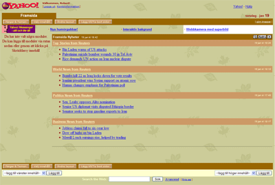
As of lately, I’ve been trying to move my program/service usage online more and more, to make it accessible from any computer and also not to lose information in case of a computer crash. Part of that has been finding a service to follow all the feeds I subscribe to. If you don’t know what a feed is, read Wikipedia’s Web feed definition.
So, deciding which ones to test, amongst other sources, I turned to the statistics for this web site to see what the people who are subscribing to my feeds are using. My conclusion was that the four that seemed most popular were:
The important thing to think of when using these kinds of services is that they should support importing and exporting of OPML files. Then you can just move your feeds from service to service and save them in a file for later reference, instead of entering all the feeds over and over again.
Don’t regard this as a professional review but rather just as a regular computer user testing them out. My impressions were:
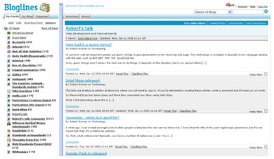
Bloglines
From what I gathered, Bloglines seems to be the most popular service online and generally I think it’s ok to use, no more, no less. I don’t like the layout using frames, although I really have to give them credit for their excellent PDA version (the only serviced I’ve had the opportunity to test on a PDA). My preferred usage is to keep my read and unread posts together in the order they were posted by the author, together with an indication in the navigation of how many unread posts there are in that specific feed. Bloglines, as well as all the other services have that indication.
However, one thing that bothers me is that the read feeds disappear from the default view when I click on a feed. It is possible to retrieve them again, but that requires extra steps. An alternative to this is to use Clippings to save your favorite posts, but that’s not as interesting to me.
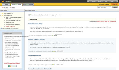
NewsGator
NewsGator is very similar to Bloglines but with a slightly more appealing layout. It implements the same things with removing read posts from the default view and having Clippings for favorites. The thing with NewsGator, though, is that the whole feed disappears from the left hand navigation, if it doesn’t contain any unread posts. Very annoying.
Google Reader
Google Reader has a default layout which is very sparse but good, and it displays only the latest updated posts. It also has support for keyboard shortcuts, of which I’m a real aficionado. But, as soon as you click the Your Subscriptions link, it takes up the entire top part of the web page.
I would really like to see a way to check posts feed by feed without losing so much space of the web page. Google Reader definitely has potential in my eyes, though.
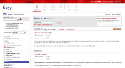
Rojo
First, I love Rojo’s front page with the Most Read Stories and Recently Tagged Stories, it’s a great and simple way to see what’s talked about right now. Rojo has also taken a little different approach with tagging posts, something I really like and it makes it very easy to find mine and other people’s posts for a certain topic.
After that you have a number of ways to view your feeds, and the different options you make should stick. Unfortunately, expanded blocks in the Feeds tag view doesn’t seem to be consistent/stable when it comes to that, but otherwise it works fine. Overall, it does seem just a tad slow, though.
Conclusion
I didn’t really find any service that was perfect, but out of these I have to say that Rojo is my pick. One of the reasons for that was the updating frequency, the other services can lag behind up to half a day; I want my information instantly! 🙂
So now I use Rojo and another similar service that I will tell you more about another day. I do urge you to test these out; maybe one or several of them are spot on for you.
Are you already using any of the above, or some other service that you would like to tip me about? Let me know!
A while ago I was invited amongst a lot of other people to beta test the new service Newsvine. I know that the title of this post might imply pessimism, but it’s not meant like that; it’s a rhetorical question.
So, first, what is Newsvine? Basically, you have a number of options as a user. You can:
Read articles collected from around the web
Write your own blog
Seed articles, i.e. have a list of links with description to news that you find interesting
Then you can either comment on a post/article, live chat about it or endorse it so it gets a higher ranking. You tag all your posts and articles, and you can search or browse pre-defined categories in a top menu of the web site, or through a search at the top where you can specify a certain tag to look for. You can also add authors or tags to a personal watchlist.
One of the things I miss as a user is a way to only search through the links I’ve tagged as, for instance, “technology”; as of now, if I click such a tag link, I get to see everyones’ posts and links with that tag. Sure, I guess they can implement a so-called tag cloud, but visually, to me they’re mostly annoying.
At first I had a hard time finding any usage for it; there are a lot of different services out there to track news and other information, especially in the technology department, and most people have an abundance of feeds they also follow. I think one of the fundamental ideas of Newsvine is to gather a lot of new and, not to say the least, useful information in one place. So I spoke to one of my Dutch vatos, Mr. Ates, who was trying to convince me that it is indeed a useful service (also, make sure you read his Newsvine: the organic web, organized).
Now I like it a little better, however I’m not really sure I use the service as intended, though. To me, it’s more like a better version of http://del.icio.us/ where I can collect and tag articles, mostly my own that are published here, than for following news. Not sure if this is frowned upon as self-endorsement, but I guess we’ll have to see about that one.
So I guess I feel a bit ambivalent about it all. It might happen, and then again it might not. So far I’m not addicted, but maybe the future and using it some more will change that. I will say one thing, though: I’m really interested in if this will be a hit or not!
Are you already a Newsvine user? Then let me know what you think of it.
PS. As of now, Newsvine is invite-only, so write a comment if you want an invitation to check out the service. DS.