Accessibility tested web sites: Nokia vs. Sony Ericsson
Having done an amount of cell phone research lately, I’ve had the not-so-pleasant experience of seeing the level of quality of certain cell phone vendor web sites. Therefore, I’d like to compare Nokia vs. Sony Ericsson.
Background
When I see a web site used as a base for all the different national web sites for a company, spread out through the world and where getting information about and selling the product is key, there are some criteria I think must be met:
- It must be accessible to as many people as possible.
- You should always be able to navigate around in the web site.
- By making information more accessible, it will also result in a better search engine ranking.
Web sites tested
I decided to test the UK version of Nokia and the UK version of Sony Ericsson against the above mentioned measurements. Naturally, a test could be a lot more detailed than what I am about to show you, but I think it gives you a hint of the technical level and how the rest of the web sites probably are implemented.
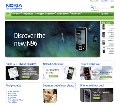
Start page, with JavaScript enabled
Nokia
Sony Ericsson

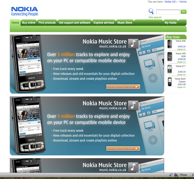
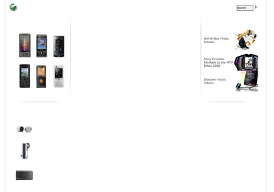
Start page, with JavaScript disabled
Nokia
Sony Ericsson
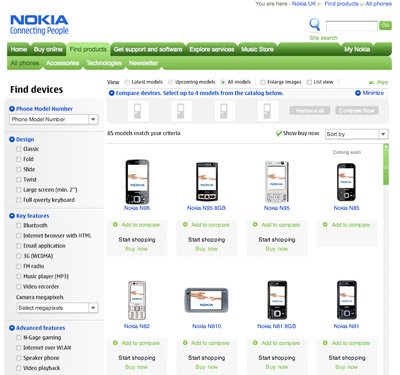
Products page, with JavaScript enabled
Nokia
Sony Ericsson
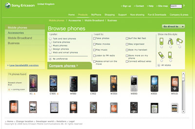
Products page, with JavaScript disabled
Nokia
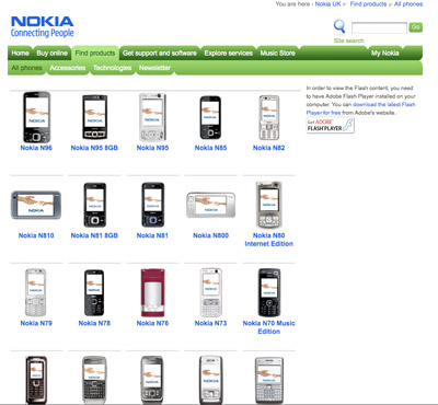
Sony Ericsson

Analyzing the results
After having tested the two pages for both respective companies, let’s run it by my three points of quality I mentioned in the beginning.
1. It must be accessible to as many people as possible.
Looking at the above screen dumps, suffice to say, Nokia has realized that you should never, ever completely rely on JavaScript for a web site. Nokia have created good fallback web pages with easy links to other parts of the web site and the products.
Sony Ericsson has completely failed to acknowledge this factor, thus resulting in pages being totally broken for users without JavaScript.
Why it really matters
Taking a quick look of how many web surfers have JavaScript enabled, it states that it is about 93%. That means missing a whopping potential 7% of your customers, just out of not doing a professional job to begin with.
But the problem doesn’t really stop there. Add to the mix overzealous anti-virus programs, strict company proxy servers and firewalls, effectively blocking JavaScript to a lesser or larger extent, but leaving that number of users outside of the statistics; a perfect case for unobtrusive JavaScript, though.
Nokia: pass. Sony Ericsson: failed.
2. You should always be able to navigate around in the web site.
As you can see, all parts of the Nokia web site is available without JavaScript, and the menu navigation looks and behaves exactly the same.
Without JavaScript on the Sony Ericsson web site, you practically don’t get any content, and the menus are solely Flash-based without fallbacks.
Nokia: pass. Sony Ericsson: failed.
3. By making information more accessible, it will also result in a better search engine ranking.
Why this is interesting from a search engine ranking perspective, making it even more important from a business standpoint, is that when there’s almost no proper internal linking going on in a web site, and fewer elements to find text in and virtually no proper and semantically marked-up code, it will affect the search results.
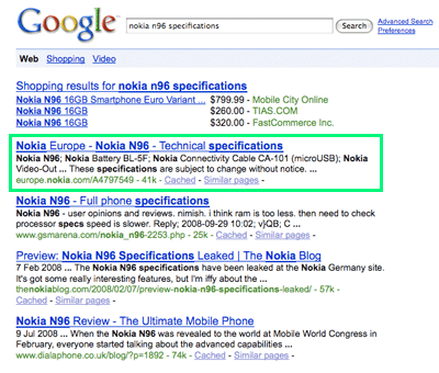
I took the liberty by searching on Google for one each of the companies’ products, together with the word “specifications” (on Google.com; local variations may apply). The results, literally, are as follows:
Google search for “nokia n96 specifications”
As you can see, a Nokia web page is result number one, just as expected.
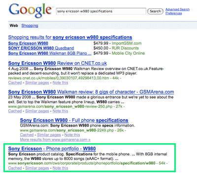
Google search for “sony ericsson w980 specifications”
To prove above established point, Sony Ericsson fails to gain the first position, and isn’t actually found until the fourth place, surpassed by CNET and GSMArena.
So, again: Nokia: pass. Sony Ericsson: failed.
Usability concerns
Another thing which I thought I’d mention, but is a little bit our of the scope for this article, is that, for both companies, by using Flash for their products pages, it raises some usability concerns:
- The Flash with the available cell phones has a fixed height, which makes it far less than optimal in the web browser window; the height should naturally be adapted to its environment.
- A native scrolling method is introduced in the Flash, where the result is both a small local scroll instead of just the page scroll, and also that the scroll wheel doesn’t work for any of them.
- If I for instance want to open three product detail pages in different tabs, it’s impossible. In their choice of Flash as a technology, they have crippled my normal web surfing behavior, with a “we think we know what work flow is best for you”-attitude.
Conclusion
There are lots of other things which could, and probably deserve to, be dissected when it comes to these web sites and factors such as truly accessible and semantically correct code, HTML validation errors, performance etc, but let’s leave that for now.
I think what this shows is that the overconfidence in Flash is very much still out there. And please, let me point out that I have no problem with using Flash, but given the usability and accessibility challenges offered, why go down that road if it doesn’t really offer any heightened end user experience? Just use the right tool for the job, really.
The Flash in the Sony Ericsson web site states, for every page load:
There’s a lot to load, but it’s worth the wait
In your case, it’d say it’s not worth it, neither for you as a business nor your end users.
Therefore, I strongly urge any Web Developer out there to seriously take accessibility into concern, and to anyone ordering a web site from a company, demand that this crucial factor is seen to.

Great entry, Robert. I really hope that the right people at the respective companies (and others) see this.
Gustaf,
Thank you, I hope so too!
I mean, somewhere along the line, someone have to explain that they knew nothing of accessibility or completely ignored it. Either is really, really bad, especially more so for the template of a world-wide site.
[…] Accessibility tested web sites: Nokia vs. Sony Ericsson – Robert’s talk – Web development and Inte… "Having done an amount of cell phone research lately, I’ve had the not-so-pleasant experience of seeing the level of quality of certain cell phone vendor web sites. Therefore, I’d like to compare Nokia vs. Sony Ericsson." (tags: accessibility nokia sony-ericsson testing mobile javascript) […]
Each time I load up this site I just love the swiftness of it. Navigation is a cake. And it's just awesome in it's simplicity. So if I were Robert, I'd too would be wondering how on earth those companies didn't call me when they needed a new site 😉
Loved the pagerank test, dead on target I's say.
Cheers, Stefan
Ah, I've noticed this with these two sites as well Robert (and drawn similar conclusions!)
I've been spending quite a bit of time at both sites lately as I'm thinking of upgrading my phone. Currently, I have a Sony Ericsson – and I like their phones more than Nokia. Yes, I like the iPhone – but I don't like O2 (the phone's UK exclusive provider) – so that's not an option for me.
Both web sites (Nokia and Sony-Ericsson) rely far too much on scripts and that's definitely bad practice.
I don't think it's all bad for the Sony-Ericsson site: I mean, for the visitors with javascript and flash enabled, I think it is the better of the two sites and has some nice design touches in there. I've enjoyed using the site far more than the Nokia web site. There is no excuse for the lack of non-javascript support though – and they'd be wise to resolve that soon (but I doubt they will).
Over-reliance on Flash with the Sony-Ericsson site reminds me a lot of some car manufacturers' web sites too…similar thing: "Ooh, it's slick, it's trick, it looks wonderful….we must use it for everything!" (while completely abandoning best practice for accessibility and usability too! Not smart!!)
Good observations and comments Robert.
Yes a well written article Robert, nice work. You might look at Arts Tasmania, a government website here. Being transparent I should point out that DEPHA (Dept Environment, Parks, Heritage and the Arts) Web team are responsible – and they happen to be the group I resigned from a couple of weeks ago.
When they mentioned this site at my initial interview I burst out laughing very loudly. Couldn't help it – they'd just grilled me for 10 minutes about web standards and best practice. Anyway, there's nothing like the analogue arts industry to get shafted by the shiny Flash object lol… personally I think on that site JS off is the best experience.
What really gets me though is that when you go ask these guys they're – Nokia team, for example – they've had so many "designers" and "managers" slapping each other on the back that there's no way they'll see their work as flawed. For christ sake it was in the company newsletter! The general manager sent an email!!!!!
OK I'm a bit jaded in my new unemployment but having just come from a "Flash Banner on everything" environment I could draw and quarter Mr Flash developers far and wide for this kind of stuff.
Apologies for the rant everyone [did I mention I bought a Nikon D90 to console myself – Robert called me a bastard but I had lost faith in Santa so got it myself] 🙂
Sorry that link to Arts Tasmania is
http://www.arts.tas.gov.au/
I'd truely love to see how this could improve the stats. It's the local poster child for worst practice BTW. I've been meaning to do an article on it but it's just too easy. Swishy navigation you have to chase, and all that swishy stuff.
Stefan,
Thank you very much. 🙂
According to Alexa, 99% of other web sites are slower, so that feels good. Feels good that I have done my performance homework.
Matt,
Thank you!
Sure, it's not like everything's wrong with the Flash versions of their web sites (although overall, personally I don't prefer them). And the web is full of people using things just because it's possible, but not necessarily always the most suitable.
Steven,
Thanks!
I won't go into Arts Tasmania in detail here, but thanks for the rant!
Also, congratulations to the camera! I have no idea where that bastard comment would have come from… 😉
[…] ???????? sites ?????????? ??????????????? (accessibility). ?? ???? ?? post ???????? ?? ????? ??? ??????????? ?????????? ??? […]
[…] Robert Nyman does just that with the Nokia and SonyEricsson UK sites and finds some surprising results. It’s quite a good write up. […]
[…] kollega Robert Nyman har gjort en jämförelse av tillgängligheten pÃ¥ Sony Ericsson och Nokias webbplatser. Sony Ericsson drar tveklöst det kortaste strÃ¥et, vars sajt inte fungerar alls utan javascript. […]
[…] Lees verder op robertnyman.com […]